Mobile Only App: ARt Tours
ARt Tours is an app that keeps accessibility at the forefront of the design so that users in all parts of the world can have the experience of viewing all kinds of art from the comfort of their own homes/ offices/ or even classrooms.
Note: AR= Augmented Reality.
This project took six weeks to complete using Figma.
Challenge: Design a virtual art museum app.
Solution: ARt Tours is an application that allows users worldwide to have full access to a wide variety of art museums and galleries around the globe. It will enable users to have the experience of touring the most prominent and lesser-known museums in the world without having to worry about travel and all that comes with it.
The Goal:
Create the space for every art museum/ gallery worldwide to offer virtual tours for ALL users to enjoy the educational and entertainment value of it from the device of their choice.
To reduce user frustration and unnecessary cost of traveling to the museum/ gallery and to maximize time (a high-value price) spent in the museum/gallery.
My Role: Lead UX/ UI Designer
Understanding the User
Research
I conducted an unmoderated usability study to determine how users interacted with the app and whether it got the users to their end goal of purchasing tours to view.
I entered the study with “eyes wide open,” not knowing how my selected users would react/interact with the app. Still, I made some assumptions that the app would be intuitive enough to that the users could find their way to the end goal without too much of a problem. My beliefs changed because I realized that I, too, love a bit of flexibility within any app I go to and that not all user flows are the same. It was enlightening and humbling at the same time.


Personas

Introducing: Andrew
A business owner and family man, who needs accessible activities that are educational, efficient, and beneficial for his family because he wants to maximize his time spent with his family rather than stressing about insignificant details.

Introducing: Belinda
An elderly grandmother, who craves activities that keep her brain young and curious because she wants to participate in more activities with her children and grandchildren.

Andrew’s user journey map.
Paper Wireframes
Goal: To have everything accessible for the average user and to allow them the flexibility to choose what they want to view and when. If they’re a spontaneous person, I also wanted to give them the option to consider something immediately.
Starting the Design


Digital Wireframe
Goal 1:
To provide an accessible and intuitive experience for the user so that we don’t force them to think. We want them to have the options available but not be so overwhelmed that they become paralyzed by choice…. So, we take a little off their plate by doing this.

Goal 2:
The goal for this wireframe was to appeal to those that love a good sale, don’t want to think, might be a little spontaneous, and want to see things they’ve done previously. A good app does the “thinking” for the user but also provides suggestions based on recent history or preferences while adding a curveball idea or two into the mix.

Low- Fidelity Prototype

➡
⬅
Original Version: You can see where there was limited mobility for users within the app.
The original Lo-Fi Prototype link is HERE.
Revised Version: This version offered users more mobility within the app and offered more information up front.
REVISED Lo-Fi Prototype link is HERE .
After running a couple of usability tests, I found that (new) users didn’t care so much about a sale, as craving the flexibility to move around in the app, while having the information they craved at the front of the app, rather than having to work to find the information they needed.
Refining the Design
Mockups

Before
After

➡
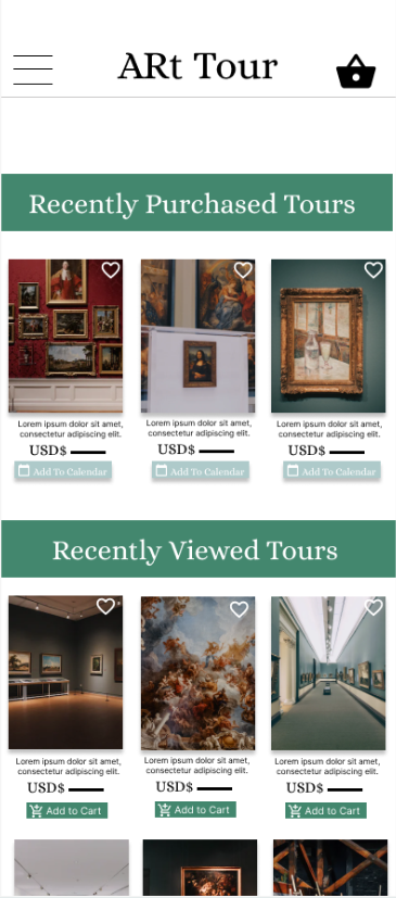
I kept the carousel at the top for Quick Access. I put a clear price and basic information below each picture of the respective tours. The Menu is more defined, with more space between sections for users to tell them apart.
Before
After


➡
Each tour selection has its own page, complete with five-star reviews, defined prices, and buttons.


High- Fidelity Prototype

Click the image above to view the Hi-Fi prototype!

Accessibility Considerations
High contrast across a majority of the platform for ease of viewing.
Use of icons along with words for understandability across all languages and assistive tech.


Large pictures for viewers to see when making selections.
Going Forward
Take Aways

“This is a great app knowing that I can have the experience without the headache of packing the whole family up to go across town and not knowing if the kids will actually enjoy it or not.”

What I learned:
I still have a ways to go in terms of making sure my apps are intuitive AND accessible.
Next Steps

I would continue making adjustments for accessibility across the board. So that ALL abilities can experience the beautiful world of art.
Change the terminology in one or two sections to avoid making users feel like we’re collecting data. We’re not; we’re using their input to customize their experiences and selections. We will also make sure users are aware of this.
Make sure users are aware of how the app works. (Augmented Reality Tours that users can experience from the comfort of where ever they are in the world without the headache of travel and insane expenses.)